Website Design for Wowzler®
Wowzler provides homeowners and real estate investors with a virtual solution that improves the buyer’s first impression. Instead of staging a home or condo, Wowzler offers a complete virtual renovation and remodel, transforming empty spaces into fully furnished and professionally designed interiors. They approached the Convergine team to develop a new brand identity and a high-performing website.
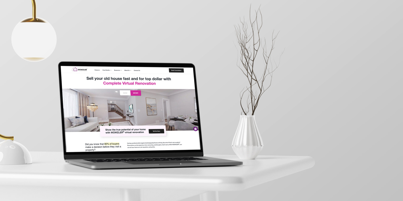
As a highly innovative and growing company, Wowzler felt it was time to bring their old website into the modern era. They needed an engaging, dynamic, and customer-centric web presence with stand-out visuals and outstanding user experience.
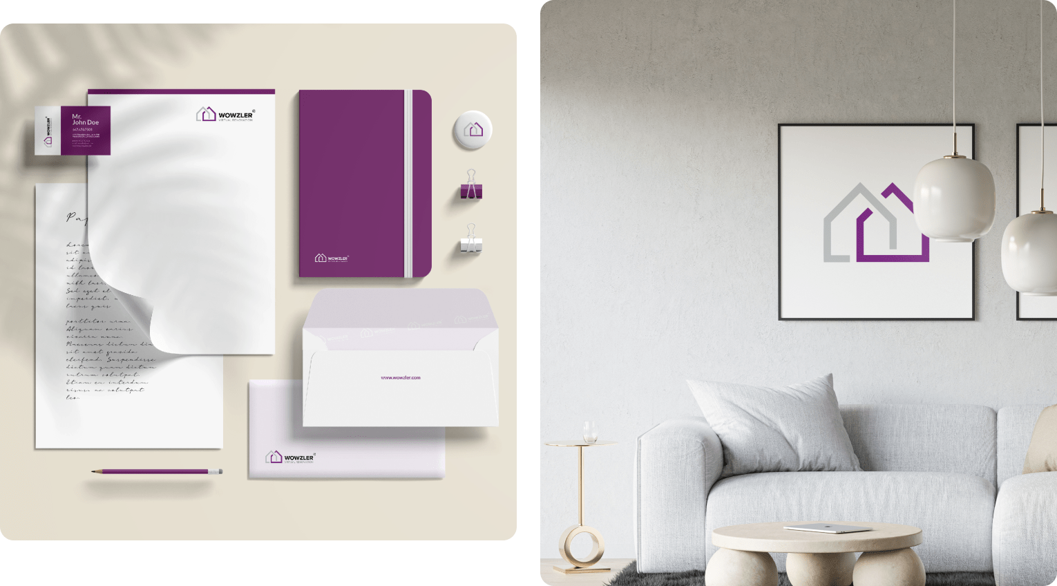
Branding
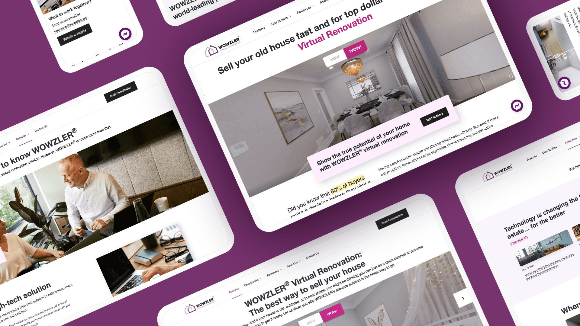
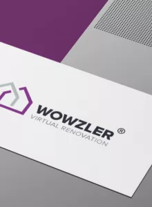
First, we worked with a client to develop a brand identity and style. We then applied new branding elements across the website. A new logo, inviting colour palette, relatable imagery, eye-catching text, buttons, and icons in bright purple create a pleasant user experience resembling a virtual tour.
Design Approach
We took a creative approach to deliver a dynamic virtual experience and tell the story Wowzler had in mind. Clean, contemporary UI with a focus on interactive elements gives users an engaging visual experience. The goal was to grab homeowners, real estate agents, and property investors’ attention from the second they landed on the home page.
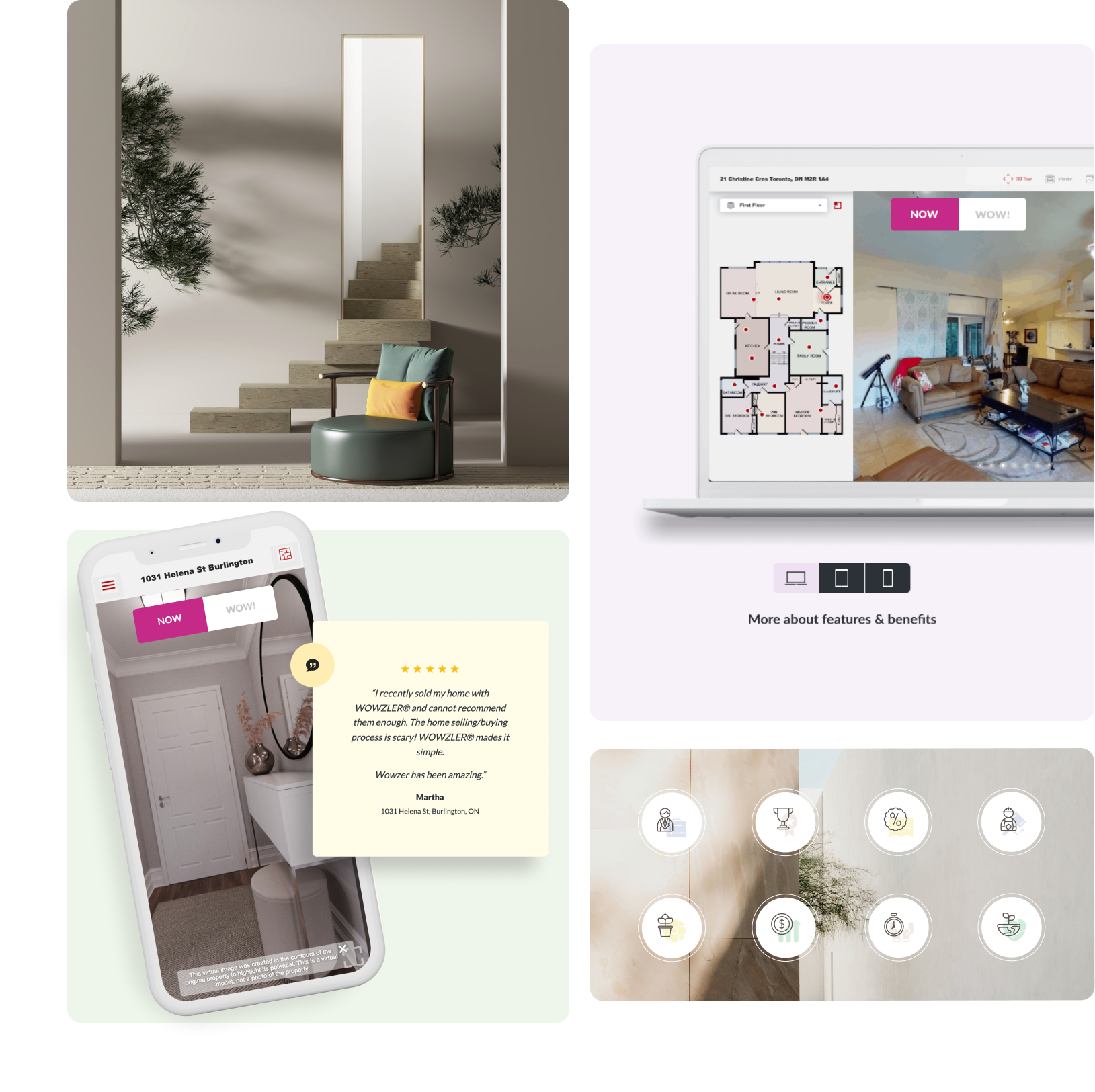
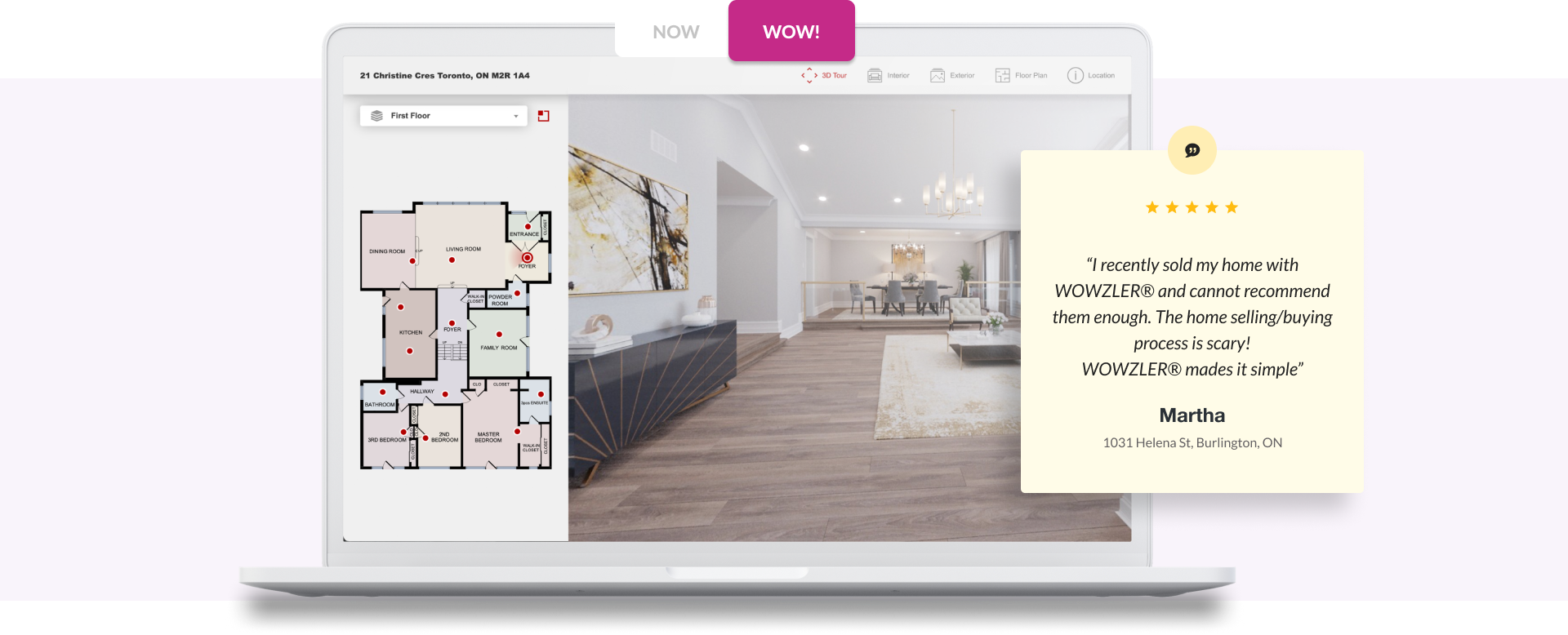
Wowzler home page incorporates an interactive banner with a 360 view giving a visitor an option to see the same property with and without virtual remodelling at the click of a “Now” or “Wow” button.
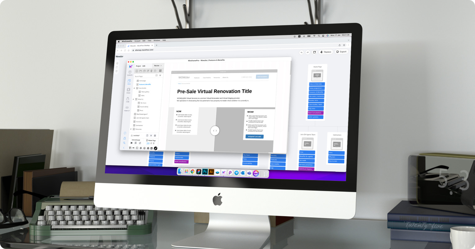
Not only does the site shows pro and cons between the conventional approach and the Wowzler approach, but it also offers a visual tour of the finished projects across multiple devices before and after virtual remodel.
Customer-Centric Content
Wowzler’s new and intuitive content flow guides users through all the company’s features and resources and draws attention to the story they want to tell to their clients. Clear and consistent messaging and cohesive branding through the new logo and eye-catching text, buttons, and icons in bright purple create an engaging user experience.
