Brand Identity Design for WallTerra
At Convergine, we believe in crafting digital experiences that reflect a brand’s identity and create meaningful connections with its audience. When Wallterra, a company specializing in high-quality wall decor products, approached us to revitalize its brand, we saw an exciting opportunity to merge our expertise in branding with their innovative product line.
The Client: WallTerra
WallTerra is dedicated to transforming spaces through quality-made acoustic wall slat panels such as wood veneer and coloured panels as well as innovative hexagon panels. Their offerings cater to residential and commercial customers looking for stylish, functional, modern wall designs. As a business that thrives on aesthetics and customer appeal, WallTerra needed a fresh, contemporary brand identity that resonated with its diverse clientele and showcased its unique offerings.
The Challenge
The primary challenge for this project was to create a brand identity that clearly communicated WallTerra’s value proposition—high-quality, custom wall decor—while appealing to a broad spectrum of customers, including interior designers, homeowners, and commercial spaces.
WallTerra’s existing brand lacked the visual cohesion needed to distinguish itself in a competitive market. Their online presence, though functional, didn’t fully reflect the innovative, creative spirit of their product line. The goal was to elevate their visual identity and ensure the new branding could support their future growth and ambitions in a dynamic industry.
Our Approach
- In-depth Brand Discovery
Before diving into the creative process, we collaborated closely with the WallTerra team to understand their vision, target audience, and core values. Through workshops and brainstorming sessions, we gathered valuable insights into what made WallTerra unique—their commitment to quality, their focus on innovation, and their desire to inspire creativity in their customers.
This discovery phase was critical in ensuring that the new brand would be visually appealing and tell the story of WallTerra’s passion for transforming spaces. - Crafting the Visual Identity
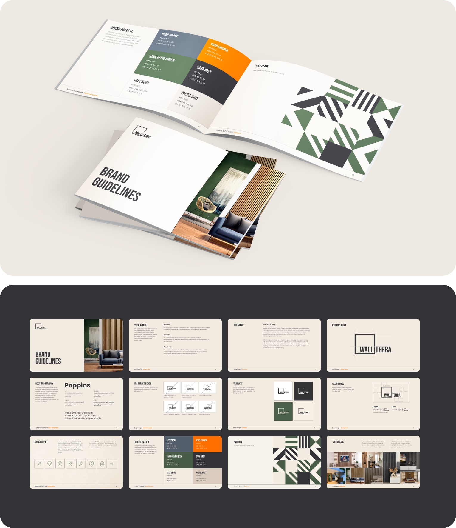
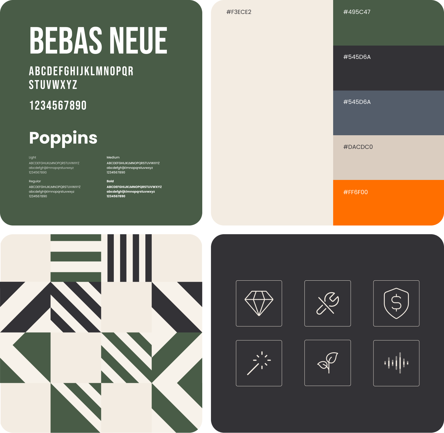
Our design team focused on creating a brand that felt modern yet timeless. The new WallTerra logo was designed to be simple, elegant, and easily recognizable. We chose a minimalist approach to the design to emphasize Wallterra’s dedication to clean, high-quality aesthetics, which mirrored their products.
The colour palette we selected combined soft, neutral tones with pops of bold colour, symbolizing the balance between creativity and professionalism that WallTerra offers. This visual identity aimed to evoke feelings of sophistication and trust, which are crucial in the home decor and interior design industries. - Developing Brand Assets
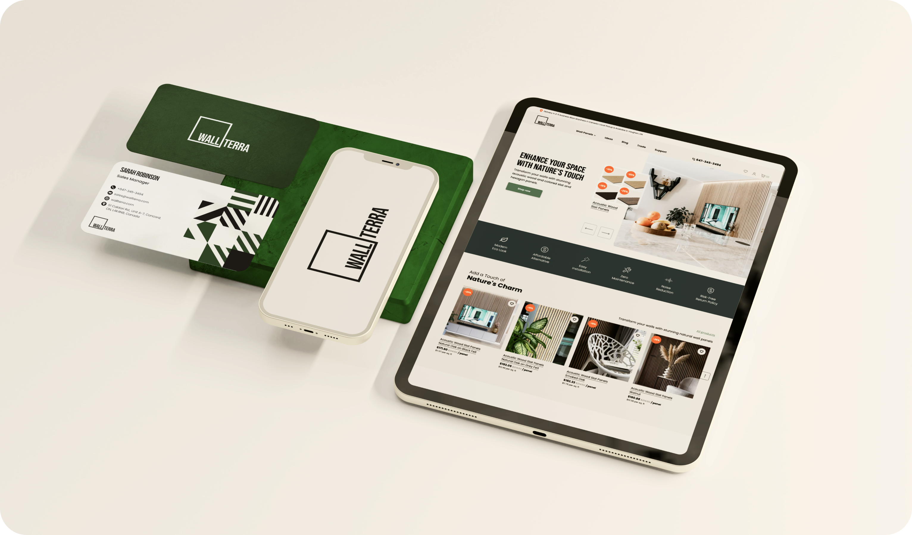
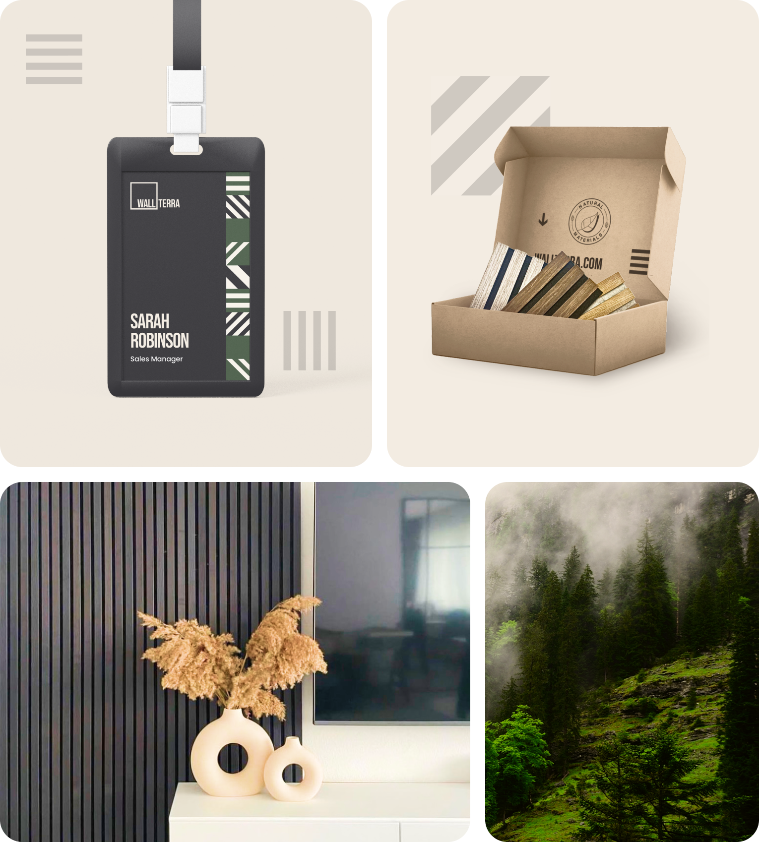
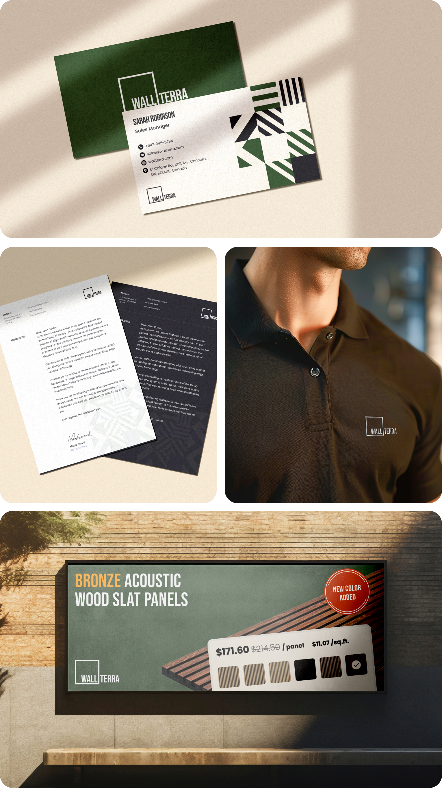
Beyond just the logo, we extended the visual identity across multiple touchpoints. This included creating consistent typography, imagery, and design elements that would carry through all brand communications. From business cards to marketing collateral and packaging design, we ensured that every customer-facing aspect of Wallterra’s brand reflected their new, cohesive identity. - Ensuring a Digital Presence
A crucial part of the rebranding was ensuring that Wallterra’s new look and feel translated seamlessly into their digital presence. We designed the website’s user interface (UI) to align with the new brand, focusing on a clean, intuitive design that made it easy for customers to explore Wallterra’s product offerings. Given the increasing trend of customers browsing and purchasing via mobile devices, we also ensured that the website was optimized for mobile use. - The Results
The client and their customers enthusiastically approved the new branding for Wallterra. The updated visual identity helped position Wallterra as a premium provider of wall decor solutions, capturing the attention of interior designers, homeowners, and commercial clients.
Since the rebrand, Wallterra has seen a significant uptick in brand recognition and engagement, with customers responding positively to the new, polished look. The refreshed branding also gave the company a strong foundation for future marketing efforts, ensuring consistency across all platforms and communications.
Social Media
We established new social media accounts for WallTerra on all major social media platforms, such as Instagram, Facebook, Pinterest, YouTube, and LinkedIn. Each account was designed with the new branding, ensuring a consistent visual identity across all social channels. These platforms are integral in showcasing WallTerra’s products, engaging with customers, and expanding its digital footprint.

One of the primary challenges was creating a brand identity that seamlessly integrates WallTerra's focus on nature, aesthetics, and innovation. By maintaining a cohesive design language across all branding elements, we ensured that WallTerra's values were consistently communicated.
- Simplicity and Sophistication:
The design approach focused on clean, minimalist elements that convey sophistication and modernity.
- Nature and Innovation:
The website and packaging materials prominently feature natural elements and innovative design solutions, aligning with WallTerra's core values.
