Self check-in kiosk UI design for LifeLabs
LifeLabs is a Canadian-owned company that has been offering health-related services to millions of Canadians from coast to coast for more than 50 years. LifeLabs is dedicated to helping patients, healthcare providers, and corporate partners while providing the best customer experience across different channels and touchpoints.

Intro
We have helped LifeLabs on various web projects including new website design and a custom shopping cart. This time they approached us to develop UX/UI design for their self-check kiosks at medical centers.
LifeLabs kiosks’ purpose is to offer a better customer experience by helping reduce lines and crowds and making the whole check-in process faster and easier. Therefore, the UX/UI design must be customer-centric, simple and intuitive.

User Flows
We started the project by consulting the client to precisely define goals, requirements and expectations. We conducted UX research to determine user personas and use cases to map out the full experience.
The user-journey chart visually represents various user scenarios from the kiosk welcoming point to the final touchpoint. This flowchart reflects every step and possible outcome the user might face when using the kiosk check-in process.

Wire Frames
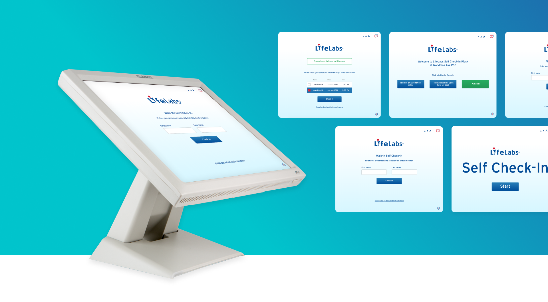
We created a set of interface wireframes to achieve the smooth and intuitive customer experience for kiosk users, making it convenient and user-friendly. The wireframes provide a clear outline of the layout, its key blocks and supporting visual elements.

UI Visualization & Development
Once the wireframes were completed, we worked on the enhanced UI designing the front-end that integrates LifeLab’s branding. Minimalistic design, consistent style, pleasant look and feel make it easy for the kiosk user to go through the step-by-step process.
In the end, we delivered the code to the client, ready to be connected to their internal systems.
