As the healthcare industry is rapidly digitizing, with more and more medical web apps being launched, healthcare providers need new tools to attract and retain patients. UI and UX design for a medical app can be a deciding factor in whether or not a user will keep navigating your website.
Convergine delivers UX/UI designs for healthcare that are intuitive and accessible for any patient. We help healthcare businesses facilitate user journeys via user-friendly designs, thereby fostering customer satisfaction and business growth.
Transform First-Time Users Into Loyal Patients
After launching several well-performing UX designs for healthcare and medical businesses and organizations, Convergine has developed a list of best practices to build a user interface and user experience that convert.
- Accessible. Patients should be able to access information about your services or book an appointment regardless of their device and medical conditions. To ensure that, your website and app should be optimized for different devices and screen sizes. Also, set up a version for those suffering from eye-related problems, etc.
- Usable and easy to navigate. Puzzling out a user journey map hardly improves user experience. Keep the design as intuitive as possible, and think through what the user needs to let them switch from one section to another in a single click.
- Light-weight. While beautiful design matters, only a few patients are eager to wait for a new page to load. So, find a balance between aesthetics and page weight to improve the loading speed.
- Adaptable. You are likely to adjust your design and content sooner or later. You need to opt for an easy-to-adjust CMS to seamlessly integrate future updates.


Rely on Data To Launch High-Performing Healthcare UX Design
User experience in healthcare delivers when it’s analyzed, thought-through, and measured. To avoid a biased and subjective approach, which often leads to budget wastage, we develop high-performing UI/UX designs for healthcare websites and applications in the following manner:
- Preliminary interview when the goals, requirements, and expectations are defined.
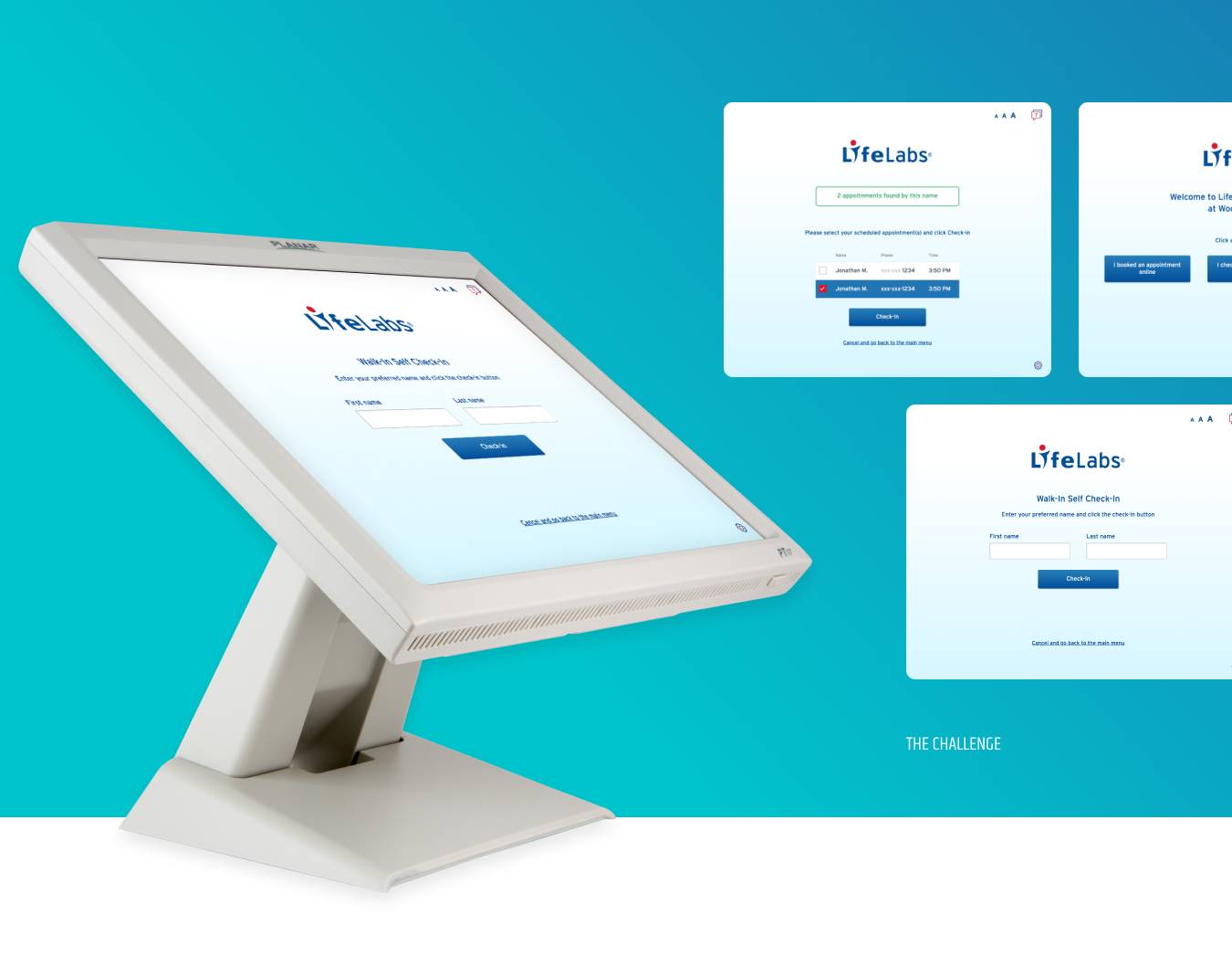
- UX research to identify user personas and use cases, which later allow us to map out comprehensive user flows. For example, for LifeLabs, we took into account every possible click, from the kiosk welcoming point to numerous final destinations.
- UX design verification/validation through special exercises such as card sorting and tree testing.
- Information architecture design.
- Wireframes to have a crystal-clear website or app layout, with key blocks and supporting visual elements.
- UI visualization and development as the final stage.


