In the simplest of terms, a product page is your digital storefront. It’s where your customers come to view and learn about your products and decide whether or not they want to buy it. Just like a standard brick and mortar shop, the look, feel and experience customers have with your e-commerce site can either increase or decrease sales.
In order to keep your business booming, and to market to the growing digital-shopping market, make sure the product page of your e-commerce website has the following things:
Have a consistent design and layout
When it comes to the design and layout of your e-commerce page, user experience (UX) is what it’s all about. Every element should be focused on your consumers’ behaviors and habits. Customers expect to find everything they need to know about a product when they click on it. Creating a single, uniformed layout for each product makes it easier for customers to select what they want, find answers to their questions, and click the “check-out” tab after they’ve filled their shopping cart.
Tell your brand story

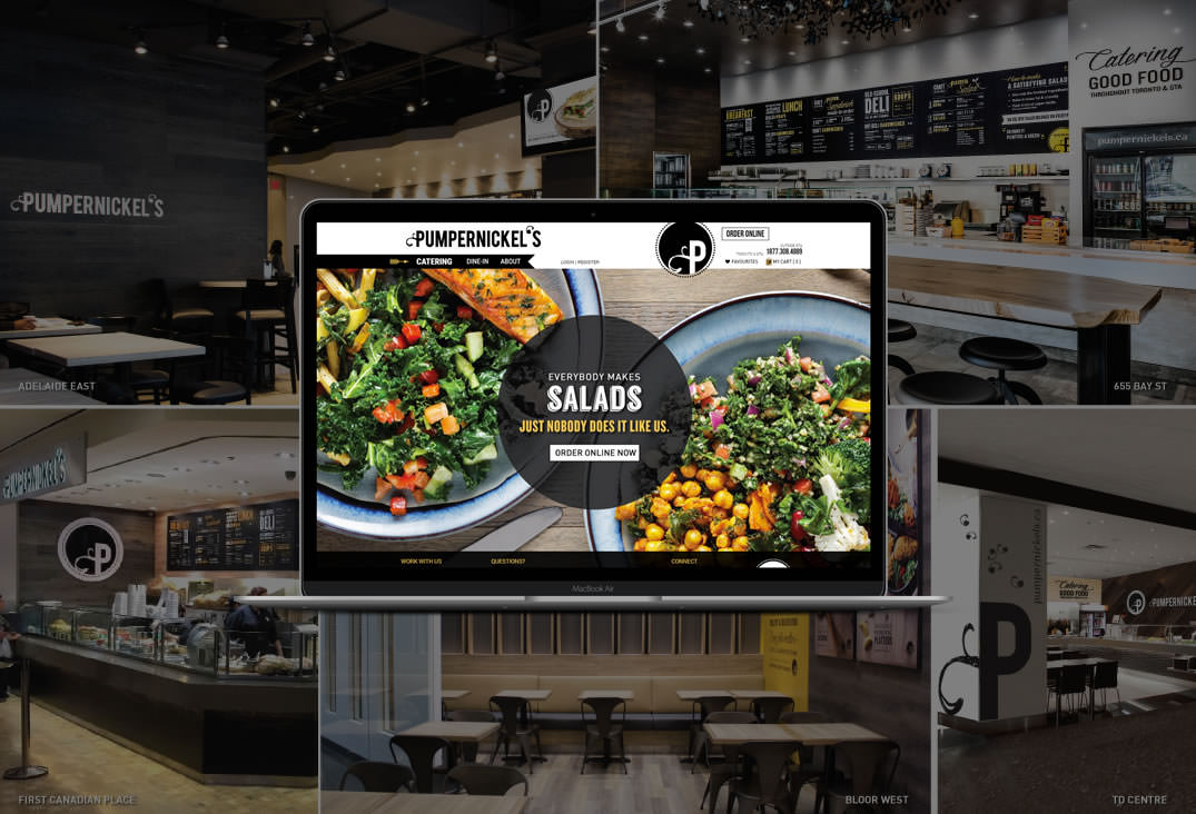
Your website is an extension of your brand and should have the same look, feel and sound like the rest of your marketing collateral. Always write in a similar tone (are you a serious brand or are you fun and witty?) and make sure your photos and marketing graphics meet your brand guidelines. Your content and design elements should be consistent throughout your entire website, from the homepage to check out.
Optimize your site for mobile

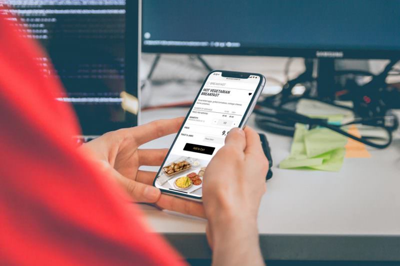
More than half of online consumers are purchasing straight from their phone now. This means that ensuring your website looks just as beautiful and organized on a mobile phone as it does on a desktop is an absolute necessity. If a consumer has to constantly zoom out to see a photo, if relevant information is missing, or if it’s too difficult to navigate, they’ll quickly open their search bar and start looking for another company.
Include clear calls to action (CTAs)

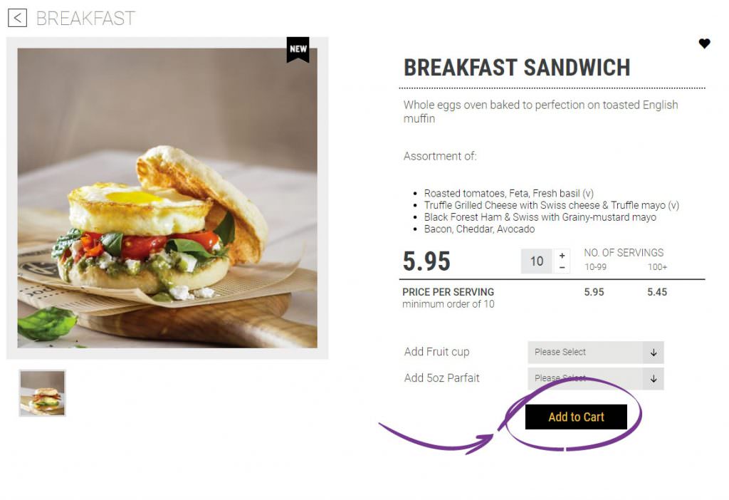
The ultimate goal of your product page is to fill up your customers’ carts and lead them to the checkout line. However, if a customer can’t find the “Add to Cart” button, they’ll never make it.
to the purchasing stage. Always use clear phrases for your CTA buttons and position them in places that are easy to find and would make sense to a first-time consumer.
Write clear and digestible product descriptions
Your product page is your showroom, and your product description is your sales spiel—get too technical and wordy, and the buyer will tune out. Sure, you love your products, but that doesn’t mean your customers are going to geek out on them as much as you. Keep your product descriptions brief and to the point, and consider using bullet points, graphics, or even videos if there is a lot of technical features to it. Ask yourself what your customers need to know and what type of questions they will have, then prioritize accordingly.
Proudly display customer testimonials
Customer reviews and social shares provide a unique third-party endorsement you simply cannot do on your own. People want to know that what they’re buying is legit, and they do this by reading other customers’ takes on the product and purchasing experience. Displaying customer reviews and encouraging honest feedback builds trust and credibility. It also provides an opportunity for you to publicly respond to reviews and let them know how much you care about their business.
Use quality images

People want to see the products they’re purchasing. Always use professional, high-quality images that show each detail of your product. Lifestyle shots, or shots of your product “in action” helps consumers visualize how and when they will use their purchased product.
Have fair shipping and return policy easily available
The downfall of purchasing online is that you can’t look at, touch, and try things on. Customers want to know that if they can return a product (hopefully, free of charge) if they don’t love it. Providing accurate and easy-to-find information about your shipping and return policies helps customers make their purchasing decisions and clears up any questions or issues after the fact.
Use your product page as a landing page
During large campaigns or promotions, you might consider using your product page as a landing page. When done right, this can support a campaign to sales by helping customers get right to the point of purchase and bypass all of the other stages of the marketing funnel, which you’ve likely already teed up through other marketing materials.
With quality, smart design, your website can introduce you to new clients, convert them into buyers, and as a result, dramatically increase your sales. At Convergine, we help companies create profitable production pages and e-commerce websites. Want to start building a new and improved online experience for you, let's have a conversation.
More good reads related to web design and e-commerce.


