

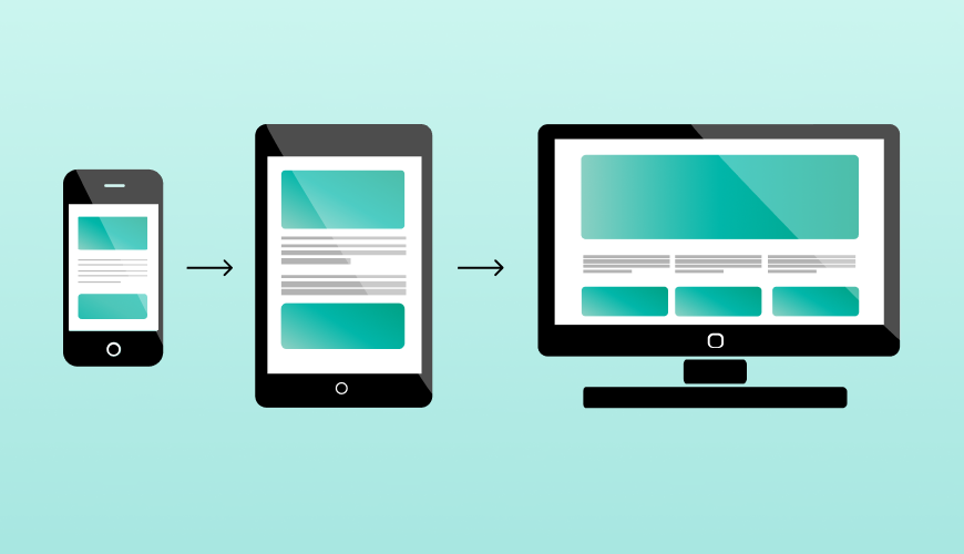
Mobile-first design builds websites starting with mobile devices, then enhances for larger screens. Unlike responsive or mobile-friendly approaches, it prioritizes mobile users from day one - crucial since 60%+ of web traffic comes from phones.
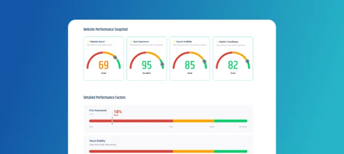
Mobile browsing has officially overtaken desktop. Today, more than 60% of website traffic comes from phones—and that number continues to grow. Yet many businesses still design their websites with desktop users in mind, leaving mobile visitors struggling with slow load times, hard-to-use menus, and layouts that simply don’t work on small screens.
Mobile-first design changes this approach. By building for mobile devices first and then enhancing for larger screens, it ensures your website delivers the best experience where it matters most—on the devices your customers actually use.
Understanding the Key Differences
Mobile-first design, mobile-friendly design, and responsive design often get mixed up.
Here's how each approach works:
| Approach | Starting Point | Best For |
| Mobile-First | Mobile screens | New projects, mobile-heavy users |
| Mobile-Friendly | Desktop | Quick fixes for existing sites |
| Responsive | Any screen size | Universal flexibility |
Key Insight:
Mobile-first builds for mobile users first, mobile-friendly adapts afterward, and responsive design tries to fit everyone but may satisfy no one.
Core Elements of Mobile-First Design
1. Content Priority
Mobile-first design begins with a fundamental question:
what does the user need most?
With limited screen space on mobile devices, every piece of content must justify its existence.
This approach demands careful consideration of content hierarchy, forcing designers and developers to make intentional decisions about what deserves prime placement.
Key considerations for content priority:
- Essential content and features appear first.
- Navigation is streamlined for mobile interaction.
2. Progressive Enhancement
Progressive enhancement is the backbone of mobile-first design. Rather than stripping away features to fit mobile screens, this approach starts with essential functionality and builds up.
The mobile version serves as the foundation, containing all critical content and features. As screen size increases, additional elements and interactions are introduced to take advantage of the extra space and capabilities of larger devices.
The progressive enhancement process includes:
- Building core functionality for mobile first
- Adding features and content as screen size grows
3. Performance
Performance is a core principle in mobile-first design. Mobile users often deal with slower connections and limited data plans, making performance crucial to their experience.
Mobile-first design naturally leads to better performance by starting with a lightweight foundation. Images are optimized from the start, code is kept minimal and efficient, and server requests are streamlined.
Critical performance factors:
- Optimized images and assets
- Minimal initial code load
The Bottomline:
These three elements work in harmony to create websites that not only work well on mobile devices but excel across all platforms. The focus on content, progressive enhancement, and performance creates a solid foundation for modern web development.
Final Thoughts
Mobile-first design flips traditional web development. Instead of starting with desktop and scaling down, it builds from mobile up. This approach focuses on what matters:
- essential content
- progressive enhancement and
- solid performance.
While mobile-friendly and responsive designs adapt to mobile screens, mobile-first design is built specifically for them. With mobile traffic dominating internet usage, starting with mobile is no longer an option because it's the foundation of effective modern web design.
