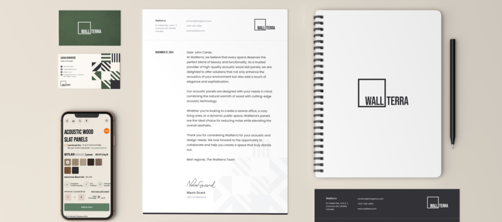
Our team is passionate about creating digital experiences that look great and deliver real value. One of our latest projects was the complete rebranding of Wallterra, a company specializing in high-quality, custom-made wall decor. In this post, we’re excited to take you behind the scenes of this transformative project and share how we helped Wallterra elevate their brand to reflect their innovation and creativity.
Who is WallTerra?
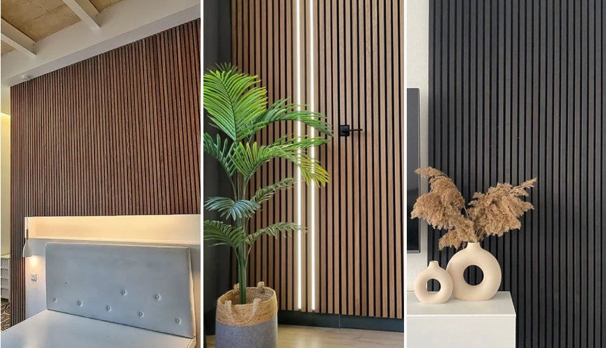
Wallterra is in the business of transforming spaces. From natural-looking wood veneer panels to coloured panels to hexagonal panels, Wallterra’s products are designed for customers who want to bring life to their interiors. Whether it’s a homeowner looking for the perfect accent wall or a business seeking modern decor solutions, Wallterra caters to a wide range of clients. Their products blend aesthetics, functionality, and quality—all things that must be reflected in their branding.
Why Wallterra Needed a Rebrand
When Wallterra first approached us, they faced a common challenge: their brand didn’t do justice to the quality and creativity of their offerings. While their products were innovative and high-quality, their visual identity lacked the cohesion and modernity necessary to capture their target audience’s attention.
In a competitive industry where first impressions matter, Wallterra needed a brand that could stand out, reflect its innovative spirit, and communicate its core values. Our mission was to refresh Wallterra's branding to enhance its market presence and position it for future growth.
Our Approach to the WallTerra Rebrand
1. Understanding WallTerra’s Vision
Before diving into the design process, we knew we needed a deep understanding of Wallterra’s business and its audience. We conducted extensive workshops with their team to uncover their goals, target market, and what made their products unique. We also explored their core values: high-quality craftsmanship, innovation, and the ability to inspire creativity through their products.
These insights allowed us to create a brand strategy that would communicate Wallterra’s unique strengths while appealing to a wide range of clients—from interior designers to homeowners and businesses

2. Designing a Visual Identity that Resonates
With a solid foundation in place, our design team began crafting Wallterra’s new visual identity. The challenge was to create something modern, simple, and elegant—an identity that would reflect the sophistication of their products.
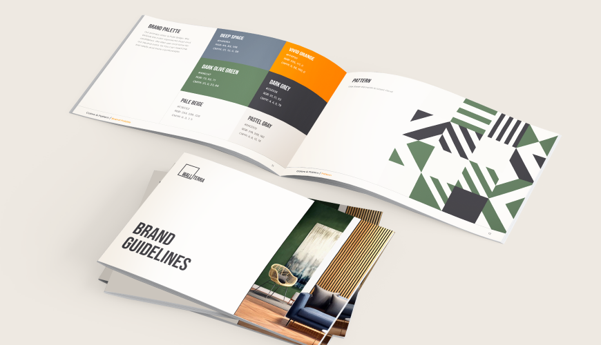
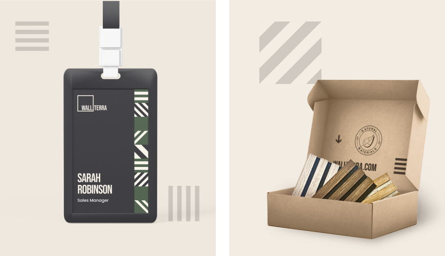
We started with the logo. Our design aimed for simplicity but with a touch of creativity that echoed Wallterra’s innovative approach to decor. We chose a minimalist aesthetic that could be recognized across different mediums, from their website to packaging and marketing materials.
Next, we selected a colour palette that combined neutral tones with bold accents. The goal was to create a feeling of trust and professionalism while injecting the right amount of creativity and modern flair. The colour scheme not only reflects Wallterra’s focus on aesthetics but also helps create a consistent visual experience for their customers
3. Extending the Brand Across Platforms
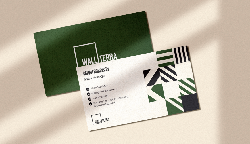
Once the visual identity was set, we worked on ensuring consistency across all touchpoints. From business cards and brochures to packaging, we ensured every element reflected the new branding.
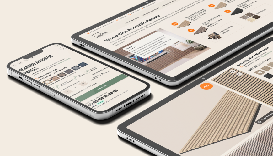
We also focused on Wallterra’s digital presence, updating their website’s look and feel to align with the refreshed brand. This included designing an intuitive and visually engaging user interface (UI) that allows customers to browse through Wallterra’s product offerings easily. We also optimized the website for mobile, ensuring a seamless experience regardless of the device being used.
The Results: A Bold, Modern Brand
The rebrand has been a game-changer for Wallterra. Their new identity now mirrors the creativity, professionalism, and quality that their products embody. The clean, modern design has made connecting with their target audience easier, and the consistency across all platforms has improved customer engagement.
Since the rebrand, Wallterra has seen a noticeable increase in brand recognition and customer interaction, especially from interior designers and businesses looking for custom solutions. Their digital presence now reflects the innovative nature of their products, making it easier for customers to discover the value they offer.
Why Branding Matters
This project is a great example of how a well-thought-out brand can transform a business's perception. For Wallterra, the new branding has refreshed its look and positioned it as a leader in the wall decor industry. A cohesive and modern brand identity can make all the difference, especially in competitive markets where standing out is crucial.
Conclusion
At Convergine, we love working with businesses like Wallterra that have a clear vision but need a helping hand to bring it to life. Our goal is always to deliver brands that are not only visually stunning but also strategically aligned with the client’s goals. If your brand needs a refresh or you’re ready to take your business to the next level, we’re here to help.
Feel free to reach out to us for a chat—we’d love to explore how we can help you create a brand that tells your story and connects with your audience.


