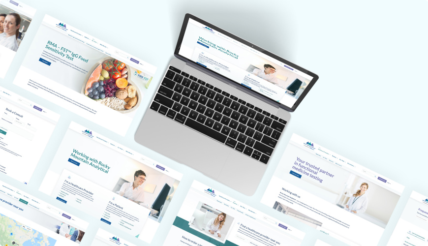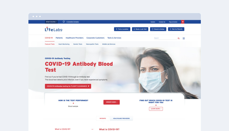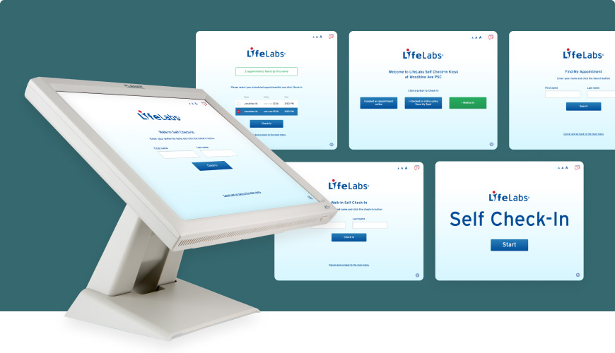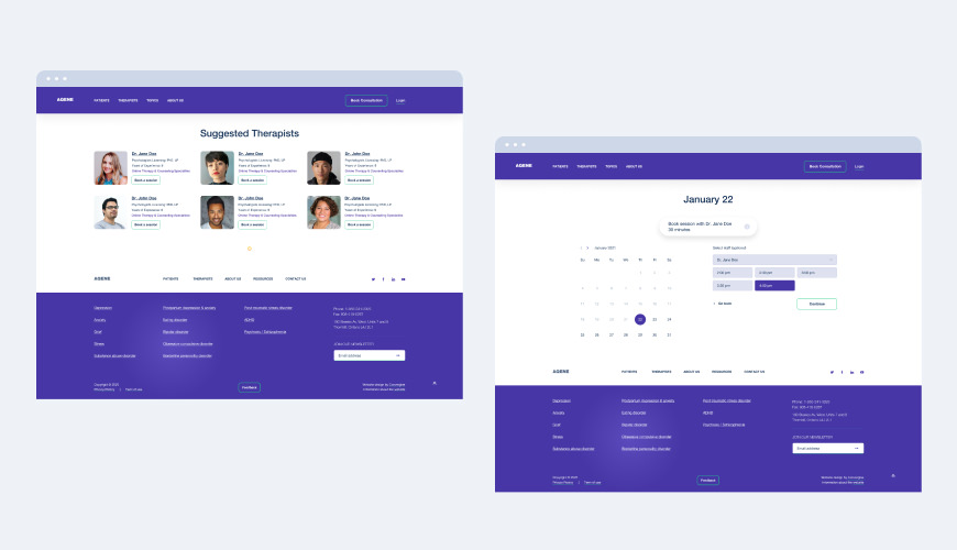
The COVID-19 pandemic triggered digital transformation across all industries, especially the healthcare sector. The number of people using the internet to find information about their health problems, choose a clinic, and book an appointment with a doctor has skyrocketed. Gone are the days when having a healthcare website was all you need to attract potential patients and make your practice visible online. In this post, we’ll walk you through the best practices for website and apps UX in the healthcare sector and all the essential features to make it engaging, customer-centric functional and easy-to-use.
Today, healthcare website needs to deliver a good user experience to attract and retain patients. When patients visit your website, they expect it to be easy to use and provide all the information they need without any hassle. The experience your website users get will determine whether or not they will become your regular customers. A 2020 research showed that 50% of healthcare consumers surveyed agreed that a bad digital experience with a healthcare provider ruins the entire provider-patient relationship.
Best practices for website UX in the healthcare sector
Data visualization
The attention span of today’s website visitors is getting shorter. Your healthcare websites should adopt data visualization techniques that will help you grab users’ attention and present them key insights visually, so users can catch the information they need in the shortest time possible. These techniques include using more infographics, creating a clear layout, and choosing a consistent color scheme throughout your website.
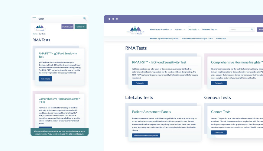
User-friendly interface across various devices (mobile is key)
More than half of todays’ global website traffic is generated from mobile devices. There is a high probability that most of your potential and existing patients will visit your website through their mobile devices. It is paramount that your website is accessible and easy to use across various devices, including smartphones, tablets, and computers.
Usability/intuitive layout
More people will use your website if they find it easier to use. A modern healthcare website should feature an intuitive design that makes users know exactly what to do at every point in time. An intuitive design will direct your visitors to the most important part of your website and help them focus on using your website to meet their needs.
Speed
Today’s users expect your website to load in a few seconds. Anything longer than that, they are off to another website. You should keep the sizes of your pages small, so your website can load as quickly as possible. Additionally, you can use Google PageSpeed Insights to improve your website’s speed.
Content structure and design consistency
Your content should be structured in a way that makes it easy for users to move around your website. Don’t pack your web pages with too much information, as this may impact users’ experience negatively. Also, you should use regular design and content patterns across all your pages, so visitors can know exactly the steps to take when on any of your pages.
Accessibility (AODA compliant)
Your website should not only be accessible from all devices but should also be usable and accessible by all categories of people, including people with disabilities. Some ways to improve your site’s accessibility include keeping it simple, making transcripts available for all videos, and incorporating features that make screen readers easier to use for people with visual impairments.
Strong search functionality
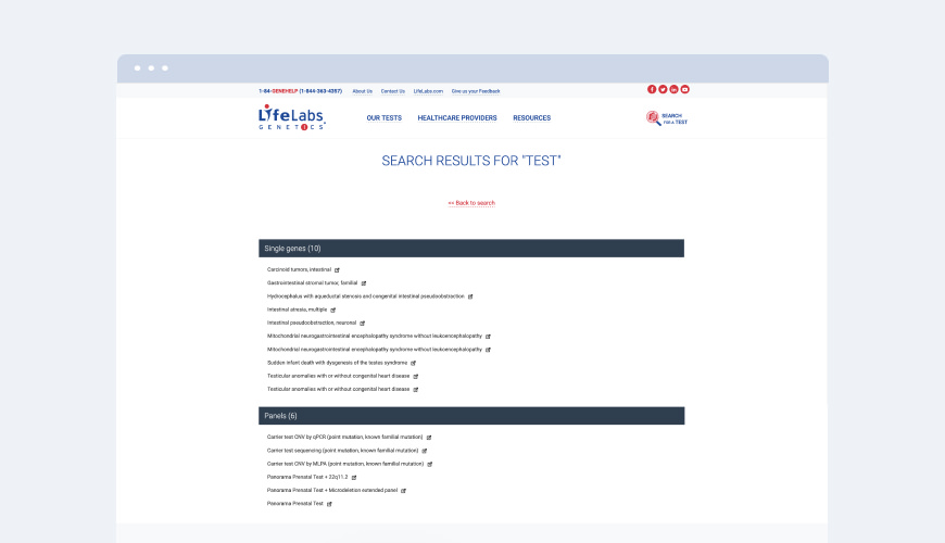
Search functionality can either break or make your visitors’ users experience. They are of great help for users who don’t have the luxury of time to skim through your website to find specific information. A strong search functionally is a must-have for content-heavy healthcare sites as it helps users search and get the information they want instantly.
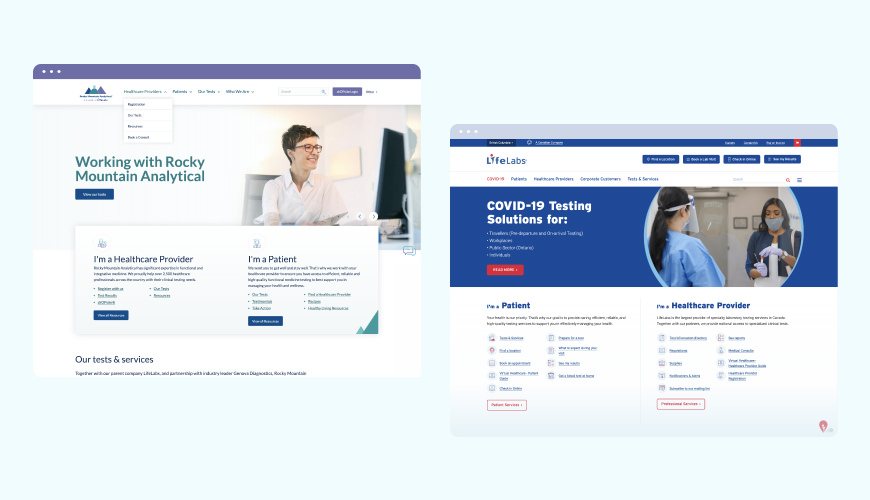
Provide separate navigation experience for patients and providers
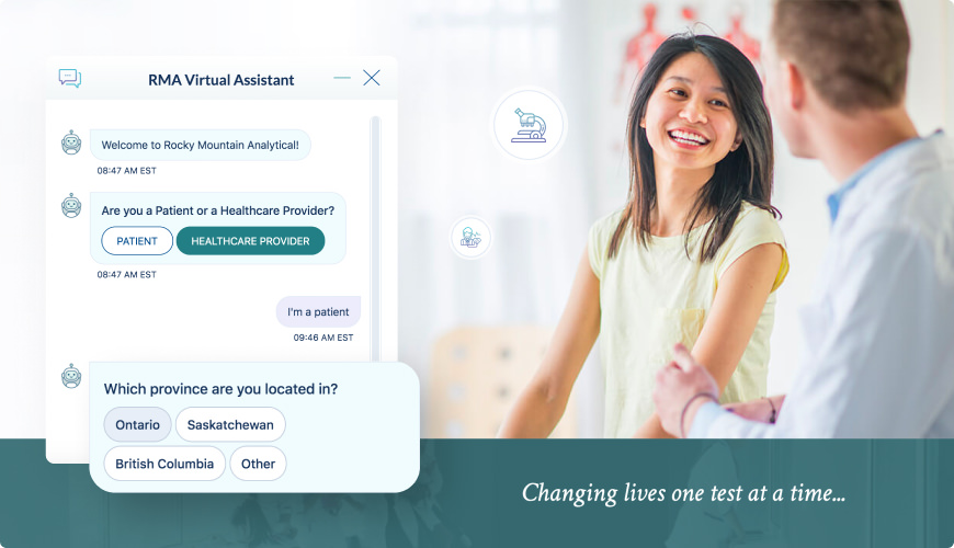
The information needs of patients and providers are different. If your website serves both audiences, it is worth setting up a separate version for each category of users. For example, patients would usually need to book appointments and find treatment methods, while providers may need access to booked appointments and helpful information to prescribe drugs.
Reliability of data
Healthcare websites should strive to minimize marketing as much as possible and focus more on providing reliable information for their users. Other UX best practices to adopt for your healthcare websites include keeping the information up-to-date, showcasing your awards, achievements, and affiliations, and providing links to original research.
Patient Portal
All modern healthcare websites should have an online patient portal that users can use to connect with doctors and access personalized health information. These portals are also great for improving patient care.
Secure
Lastly, all healthcare websites should meet the relevant security standards. Patient health information should be 100% safe on your website, and only authorized people should have access to it.
Wrap Up
Our team at Convergine considers all these guidelines and website UX best practices when building digital solutions for our healthcare clients. We have the experience and tools required to create modern, effective, and practical healthcare websites that will help you achieve your goals. Get in touch with us now to find out how we can help you get the most out of your healthcare website.
Other good reads you might be interested in:
- What we’re doing to address healthcare challenges with custom web app development
- Online Patient Portal and why clinics need one
- 20 Questions to ask a web development company


